Exhibition Booth Design for Product Launches: How to Build a Stand That Actually Sells the New Thing
Most product-launch booths look impressive… but don’t work.
They’re either:
- a beautiful structure with no clear product story, or
- a wall of messaging that nobody reads, or
- a demo area that bottlenecks the moment the show gets busy.
If you’re launching something new at a trade show, your booth isn’t just “a stand” — it’s your first live sales environment. The design has to do three jobs at once:
- Stop the right people
- Help them understand the product fast
- Move them into a next step (demo, meeting, scan, follow-up)
This article is a practical playbook for designing a product-launch booth that drives attention, understanding, and conversion — and how to iterate the concept quickly without losing coherence.
Why product launches fail on the show floor (even with a great booth)
A launch booth usually fails for one of these reasons:
- The product isn’t obvious from 5–10 metres away
- The messaging is too broad (“innovative”, “next-gen”, “leading”)
- The demo is hidden, slow, or intimidating
- The booth looks premium but doesn’t guide behaviour
- Stakeholders keep changing the story, and the design can’t keep up
The fix isn’t “more design”. It’s better launch logic built into the layout and content.
The product launch funnel (design it on purpose)
Think of your booth as a funnel with three distances:
1) Far: 10–30 metres (the “why should I care?” moment)
At distance, you need one clear hook:
- The product category (what it is)
- The outcome (what it does)
- The credibility cue (why you’re legit)
Rule: If someone can’t explain what you’re launching after a 2-second glance, you’re relying on luck.
2) Mid: 3–10 metres (the “what is it exactly?” moment)
This is where you earn attention with clarity:
- 2–3 proof points (not 10)
- A visual that shows the product in action
- A simple “who it’s for” cue (industry, role, use case)
3) Near: 0–3 metres (the “show me” moment)
Up close, you need a next step:
- Demo stations
- Hands-on interaction
- A guided conversation zone
- Lead capture that doesn’t feel awkward
Design should make the next step feel natural.
7 design moves that make product-launch booths convert
1) Create a “product hero moment”
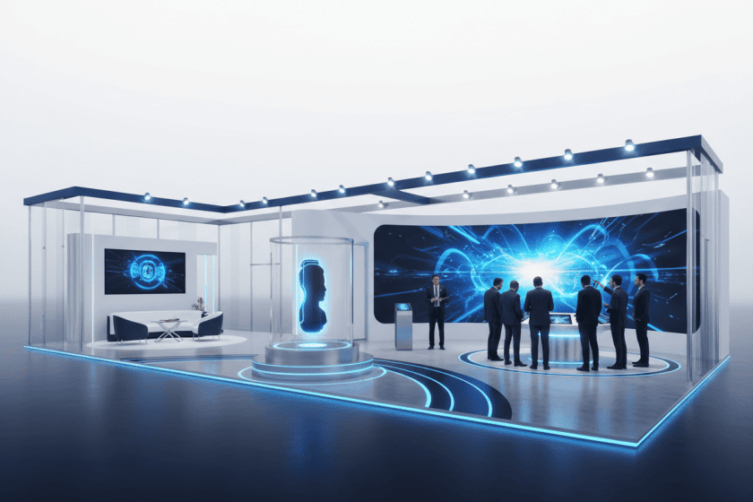
Every launch booth needs a focal point that says: this is the new thing.
Options:
- A central demo plinth
- A large product-in-use visual
- A “reveal” structure (lighting + framing)
- A screen moment that loops the core story
If you don’t design the hero moment, people will invent one (and it won’t be the product).
2) Use a single headline message (and support it)
Launch booths often try to say everything.
Instead:
- 1 headline outcome
- 2–3 supporting proof points
- 1 clear CTA (book demo, scan, speak to team)
3) Design the demo like a throughput system
Demos fail when they bottleneck.
Ask:
- How many people can watch at once?
- How many can try it hands-on?
- Can someone understand it without waiting?
- Is there a “self-serve” layer (video loop) plus a “guided” layer (staff demo)?
A good demo zone works at peak traffic, not just in quiet moments.
4) Separate “watch” and “talk”
If your booth forces everyone into one space, it gets chaotic.
A high-performing layout often has:
- A watch zone (fast understanding)
- A talk zone (qualification + next step)
- A meeting zone (serious conversations)
5) Make the staff positioning obvious
Where do staff stand so they can:
- greet people
- qualify quickly
- route them to demo/meeting
- avoid blocking the visuals?
A simple fix: design a clear “welcome edge” and a natural handoff path.
6) Build in modularity for launch messaging changes
Launch messaging evolves right up to the show.
So design for:
- Swappable panels
- Screen-led messaging
- Replaceable graphics
- A structure that doesn’t rely on one specific tagline
7) Package the booth as a “launch system”, not a one-off
If the product will be marketed for 6–12 months, your booth should be reusable:
- same structure
- refreshed content
- new proof points
- updated demo flow
That makes the launch cheaper and stronger over time.
What to include in a product-launch booth brief (copy/paste)
If you want better concepts faster, include:
- Product name + category (in one sentence)
- Target buyer roles (who you want to stop)
- The 1 headline outcome (what it changes)
- 3 proof points (metrics, results, differentiators)
- Demo type (hands-on, guided, video-led)
- Lead capture goal (meetings booked, scans, sign-ups)
- Stand size + open sides + constraints
- Brand guidelines + must-use assets
Where ExpoBooth.ai fits
Product launches are where iteration speed matters most — because the story changes, stakeholders weigh in, and you need to explore options quickly.
ExpoBooth.ai helps teams generate and iterate product-launch booth concepts from briefs, moodboards, sketches, photos, or CAD — producing multi-angle renders, close-ups, and pitch-ready variations fast, with human oversight to keep outputs on-brand and credible.
That means you can:
- explore more directions
- align stakeholders earlier
- land on a stronger concept before build deadlines hit
The takeaway
A product-launch booth isn’t about looking impressive.
It’s about making the product obvious, the story clear, and the next step easy — at speed, under pressure, with multiple stakeholders involved.
Design the funnel, build the hero moment, and make the demo work at peak traffic.
That’s how you launch properly.